Tapjoy
Tapjoy is an ad platform that gives app developers a way to monetize their games while also giving brands and other advertisers a captive and engaged audience.
- Role
- Creative Director, Ad Products
- Years
- 2012–2014
I sat in on enough cross functional meetings at Tapjoy to notice a real problem.
New devices were flooding the market with wildly different screen sizes. Every ad unit needed a custom build for every size and orientation, and most small studios didn’t have the resources for that. It was quietly shrinking the pool of usable ad inventory.
One square asset for every screen
I designed and shipped a system that let developers build one square asset that scaled automatically to any device, size, or orientation. It removed that barrier across the whole platform. Each ad format had a clear set of creative sizes, and the end card, for example, started from a single 2048 by 2048 square.
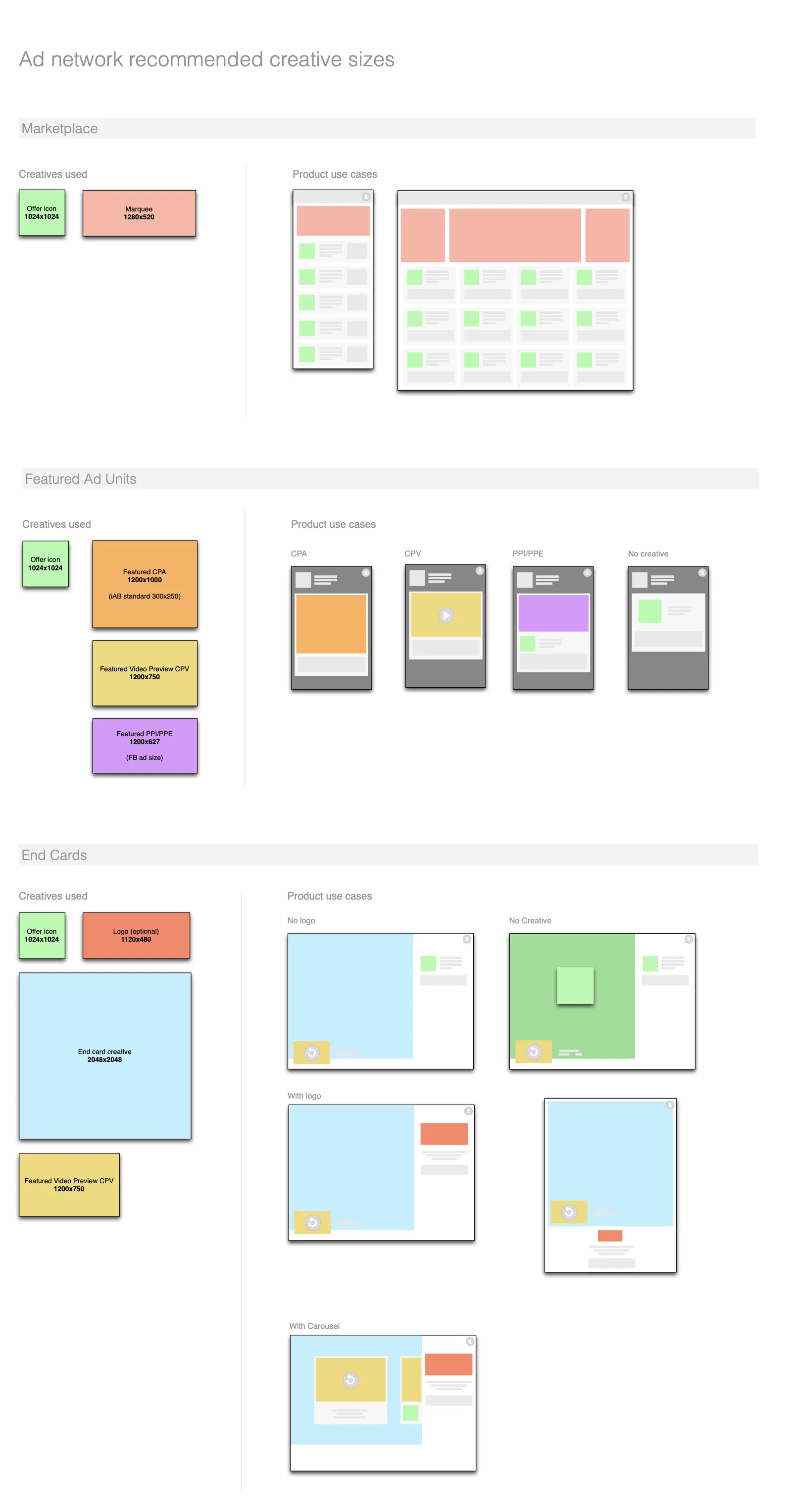
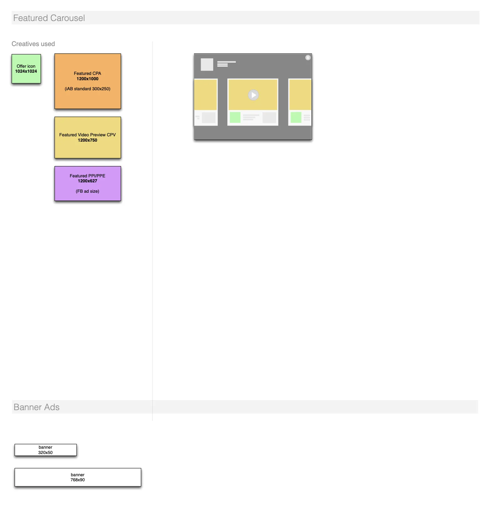
The creative sizes for each ad format. Click to enlarge.
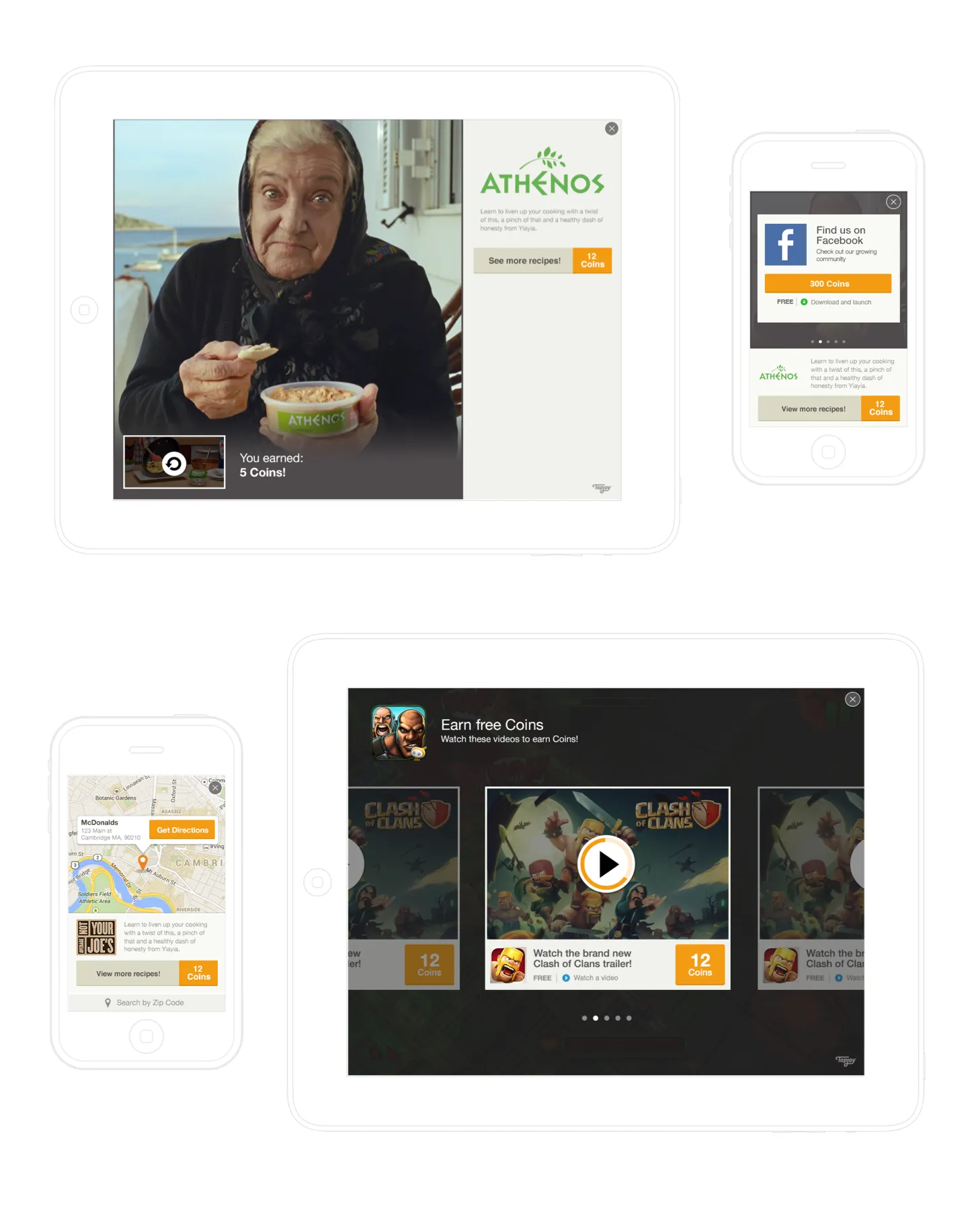
The system in use on iPad and iPhone: an end card, an offer card, a map based offer, and a video carousel.
Offer walls
I also worked on offer walls, where players earn in-game currency for things like watching a video or trying a new game. Here are two treatments of how the reward is shown.
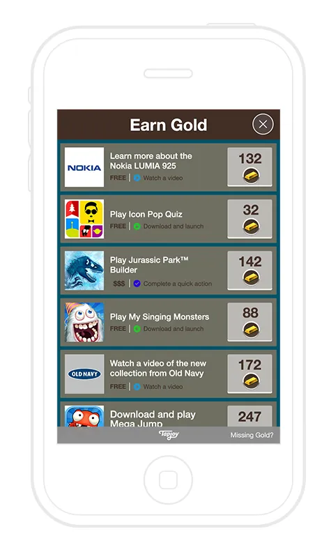
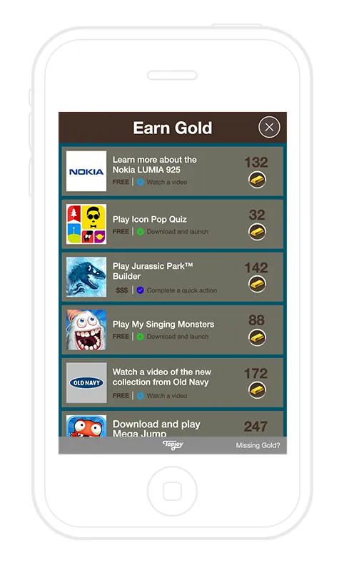
Two reward treatments: a boxed button (left) and plain text (right).
Helping people find their next game
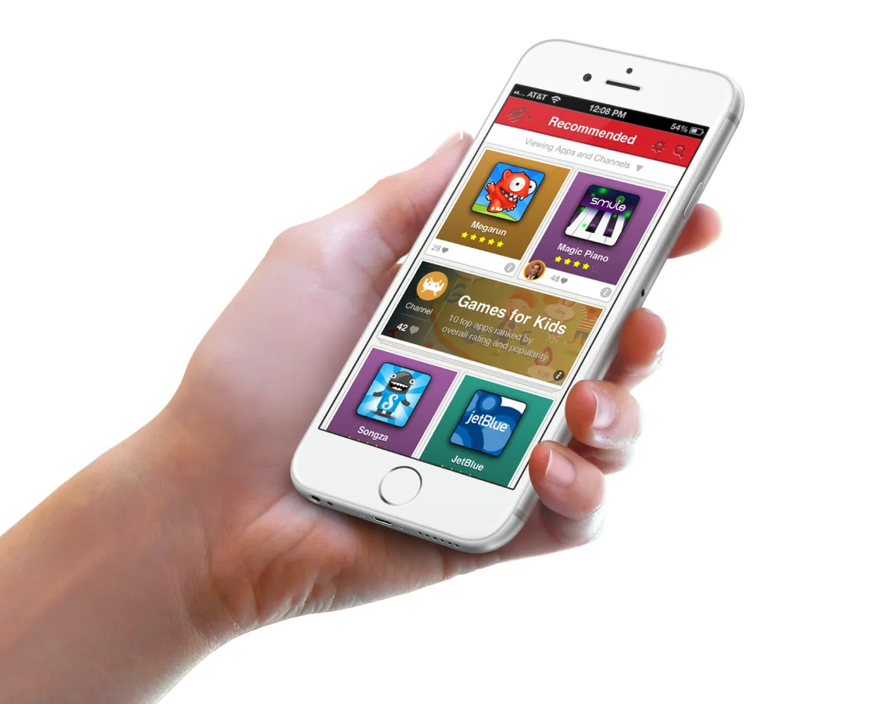
The Tapjoy SDK has been integrated into thousands of iOS and Android apps, creating a massive network of apps and user data. I pitched taking Tapjoy direct to consumers with an app discovery product, at a time when the App Store was oversaturated and people were overwhelmed by choice.
Goal: Get users within the Tapjoy network to install and engage with more Tapjoy games.
Solution: Suggest more Tapjoy network games to our current users. We connected people with games they might like by analyzing data like which games they have installed, opened recently, or have spent a lot of time playing.
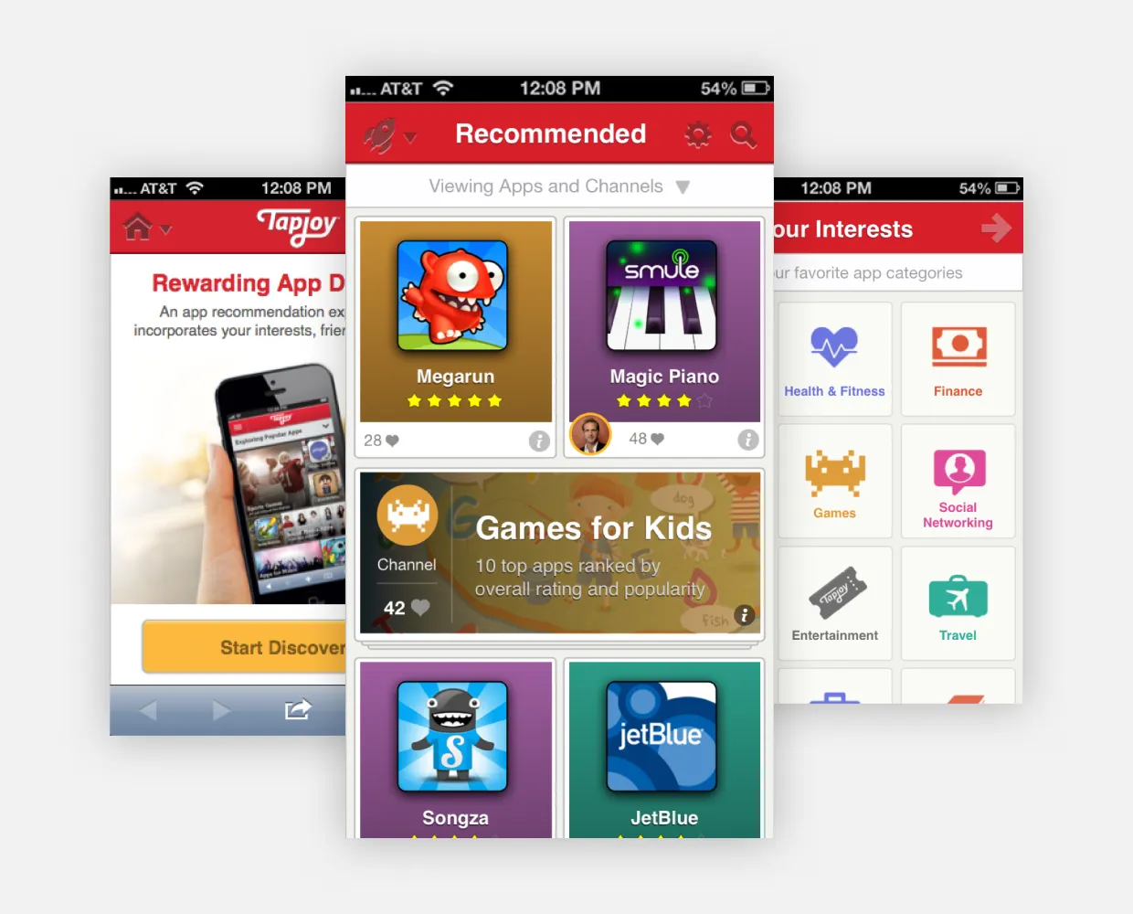
“Why are these particular apps being suggested for me?”
I ran interviews and testing through development, and early on we found that most people didn’t like having suggestions without context. They also got frustrated when apps they didn’t want, or had already installed, showed up in their suggestions.
I designed around the question they kept asking, surfacing more context about each app, along with calls to action that give people control over their results.
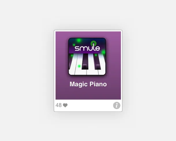
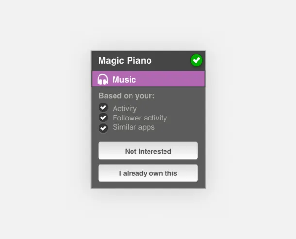
By tapping the “i” icon, people could flip the card over and see why an app was recommended. Tapping either call to action would remove the app from the list and automatically replace it with the next best option.
I also led the onboarding design for the whole experience, from picking interests to seeing the first recommendations.
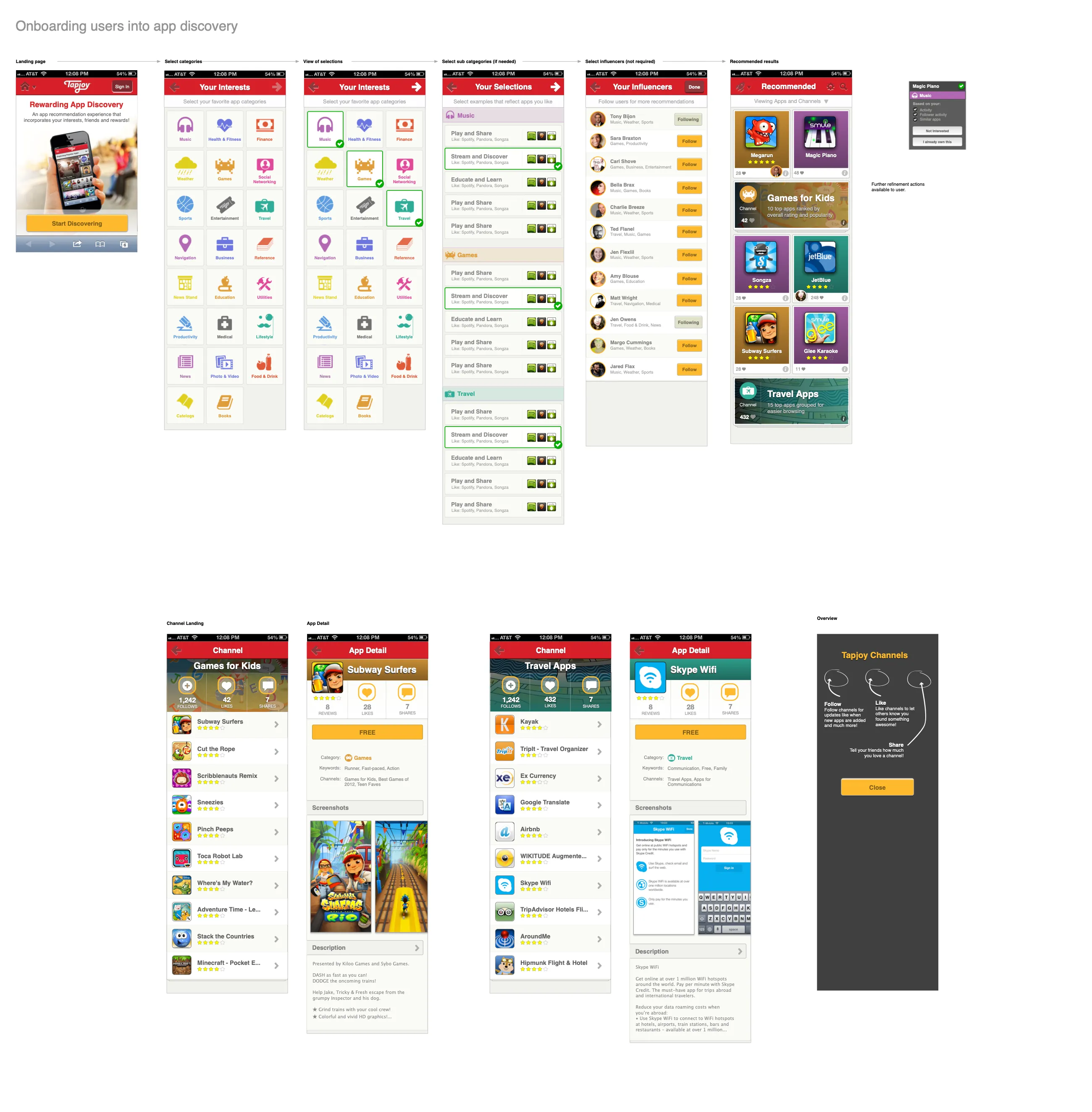
Onboarding into app discovery, from the landing page to recommended results, channels, and app detail.
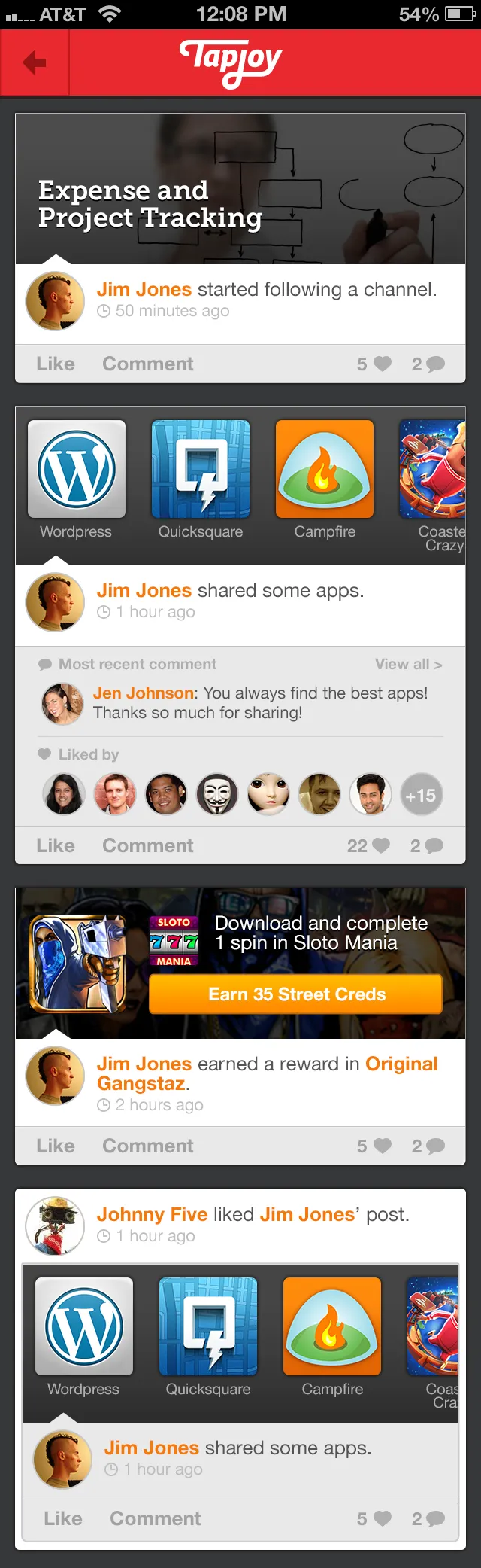
An activity feed, where friends’ channels, shared apps, and rewards show up.
Responsibilities
- UX
- UI
- Prototypes for user testing