Drync
Drync is an iOS application that allows users to scan wine labels to learn, rate, and purchase wine and have it delivered right to their door.
- Role
- Creative Director
- Years
- 2014–2015
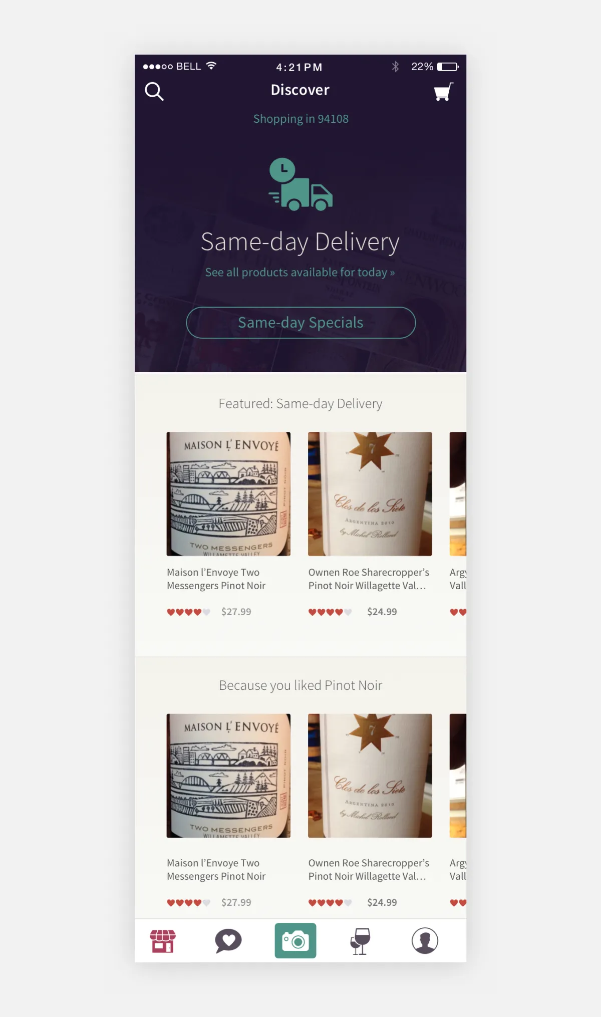
My role at Drync included analyzing and revamping the entire user experience across the board. I led a full redesign of the app’s UX and UI across iOS, web, and mobile web, and worked closely with the iOS engineers on interactions and transitions. We started with the central user flows, like scanning and purchasing. Once those flows were optimized, we took a step back and redesigned the entire application with a focus on telling a more coherent and consistent story.
A view of the redesigned app with the highly successful “Same day delivery” feature.
Rebuilding the purchase experience
Buying wine is not like buying a shirt. There are shipping addresses, a card to enter, and a law that says an adult has to sign for the box. I rebuilt the entire purchase experience, with separate flows for first time and returning buyers, saved and new shipping addresses, and card scanning at checkout.
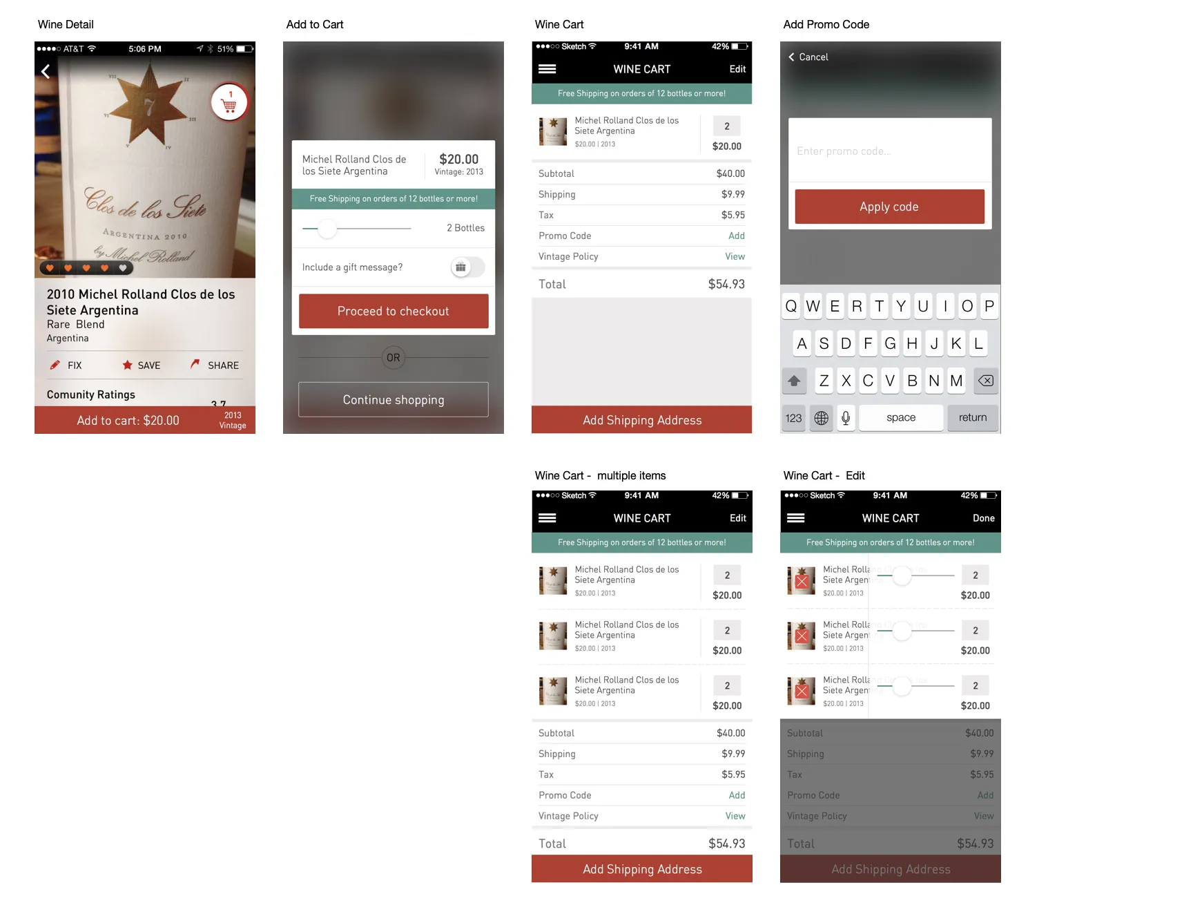
The final purchase screens, from wine detail through the cart.
Returning buyers shouldn’t have to think about any of it, so their path is short: add to cart, check the cart, place the order. First time buyers need a little more, and each of those extra steps is one more chance to lose them. Streamlining the scanning and checkout flows increased sales.
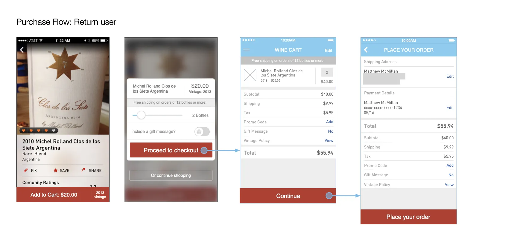
Returning buyer: four screens from wine to order.
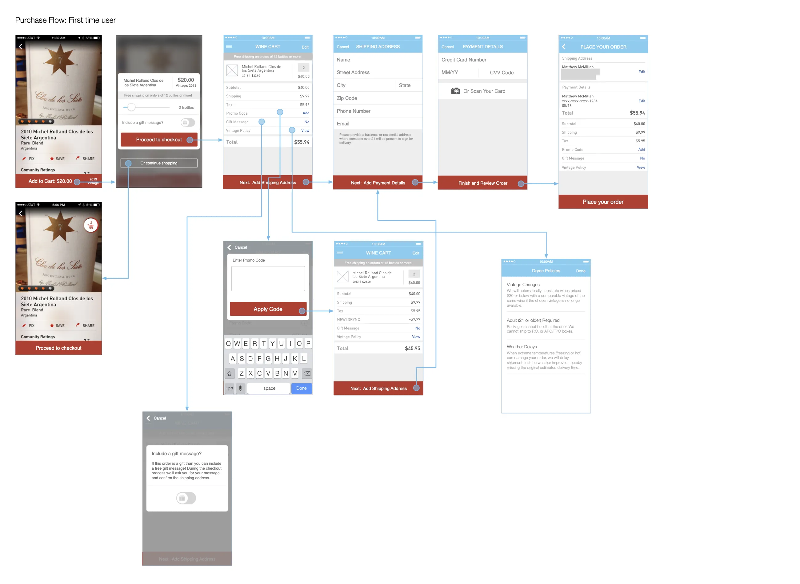
First time buyer: the same path, plus shipping, payment (with card scanning), promo codes, and the vintage policy.
Gifts, and the adult signature
Wine is a great gift, and wine needs an adult signature on delivery. The gifting flow had to handle both. Buyers add a message, choose or add a recipient’s address, and get a plain reminder that someone 21 or older must be there to accept the delivery.
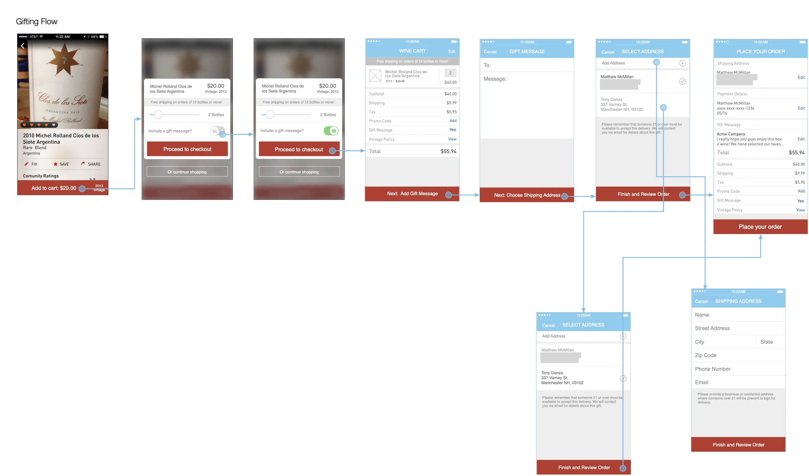
Gifting flow, with the adult signature reminder built into address selection.
The details people notice
I also mapped the smaller flows that make checkout feel careful: editing quantities with a slider, swiping to delete, managing saved addresses, and empty states.
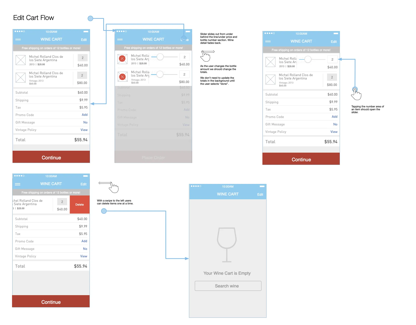
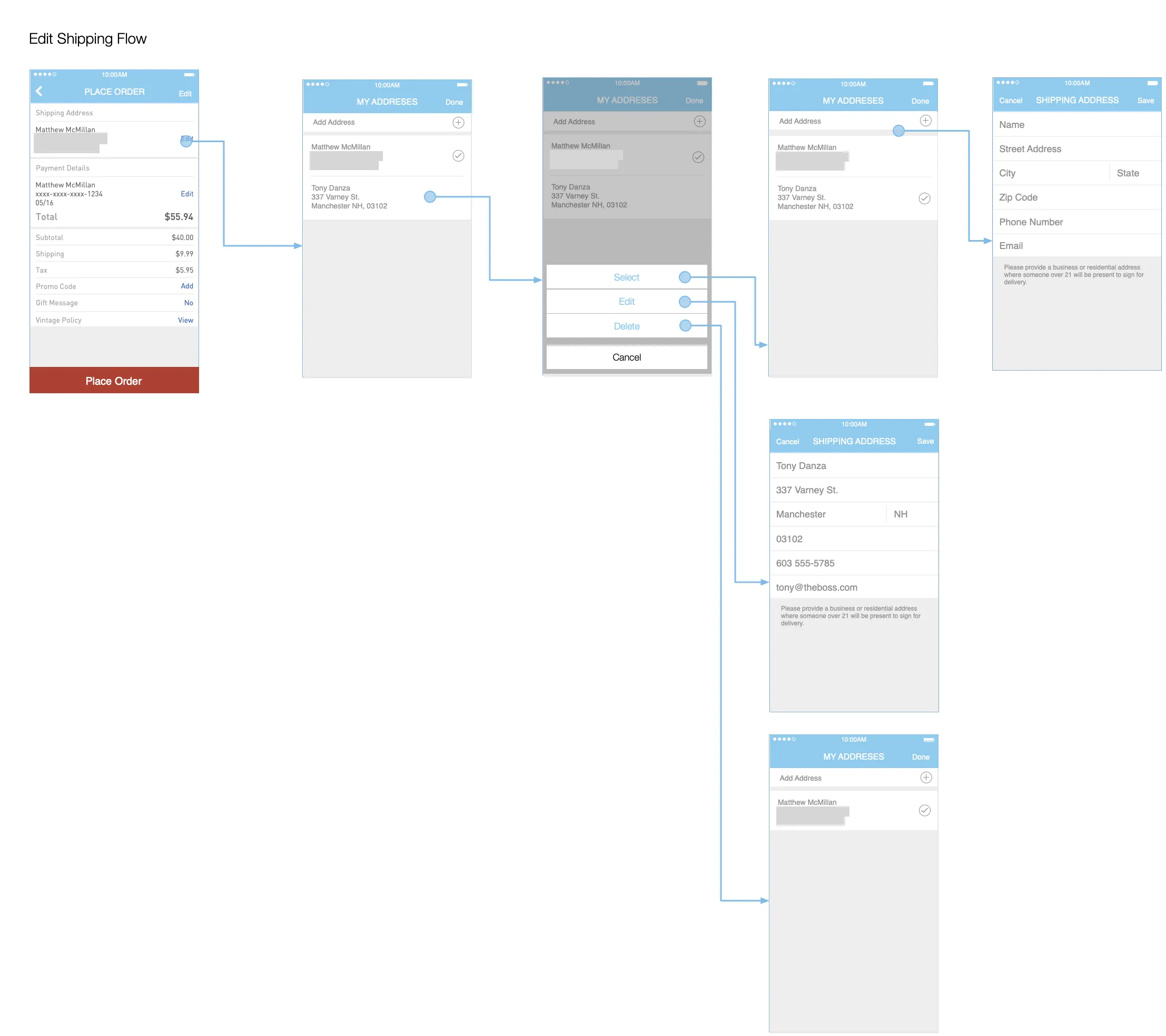
Left: editing the cart. Right: managing shipping addresses.
Getting new users to their first bottle
For someone new to the app, the first minute decides whether they stay. This flow asks for location and notifications only when it can explain why, and it adapts to where people are. If a local store is nearby, they can choose it for pickup or delivery.
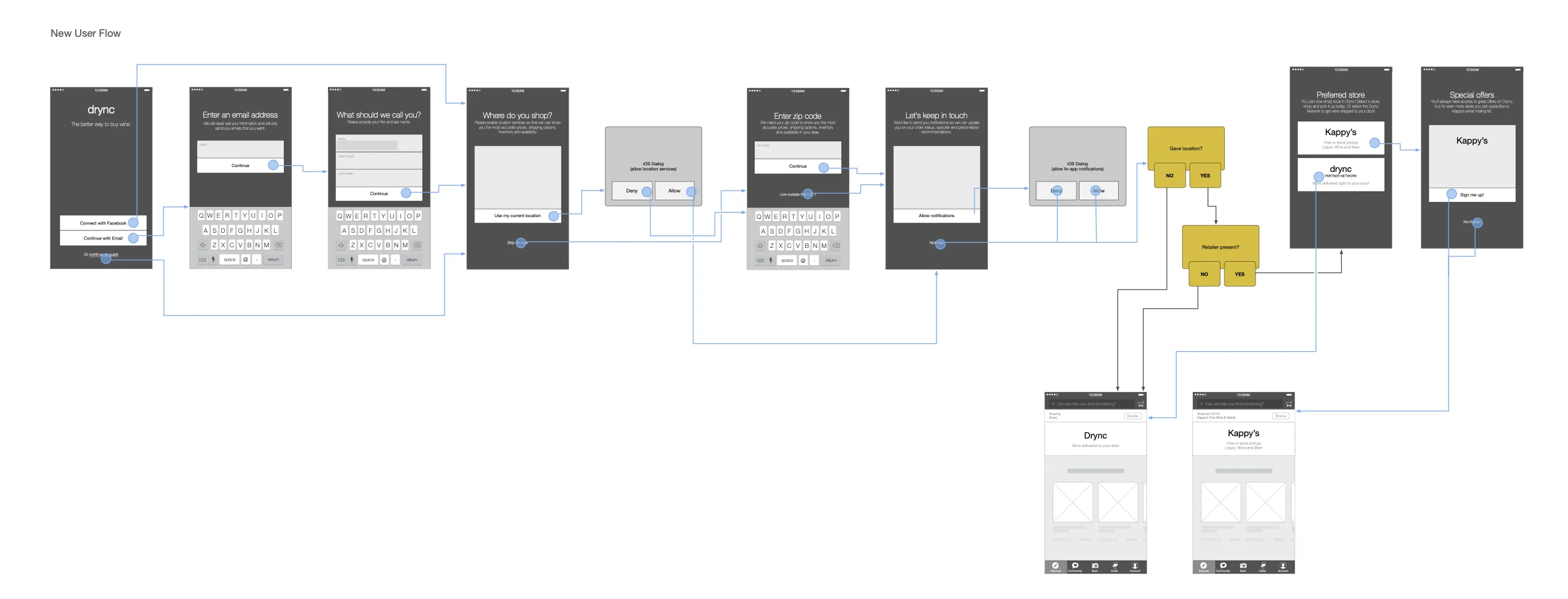
New user flow, including location and notification prompts and store selection.
Same day delivery
With retail partnerships in both Boston and San Francisco, we were able to offer wines that were available for delivery within minutes of ordering. This feature required multiple app enhancements including optimized onboarding to ensure users opted for allowing location services.
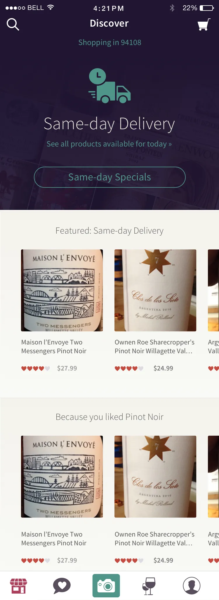
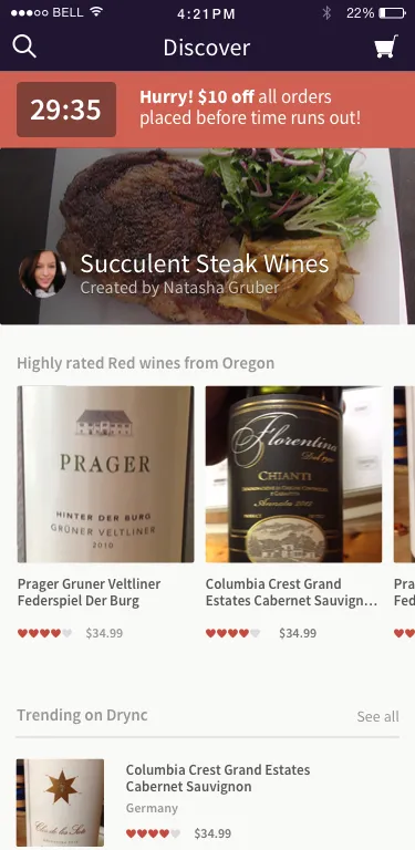
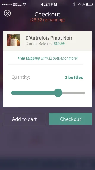
Left: Same-day Delivery on the Discover screen. Middle and right: testing urgency, with a countdown for a limited offer carried from Discover through checkout.
Wine club and Apple Watch
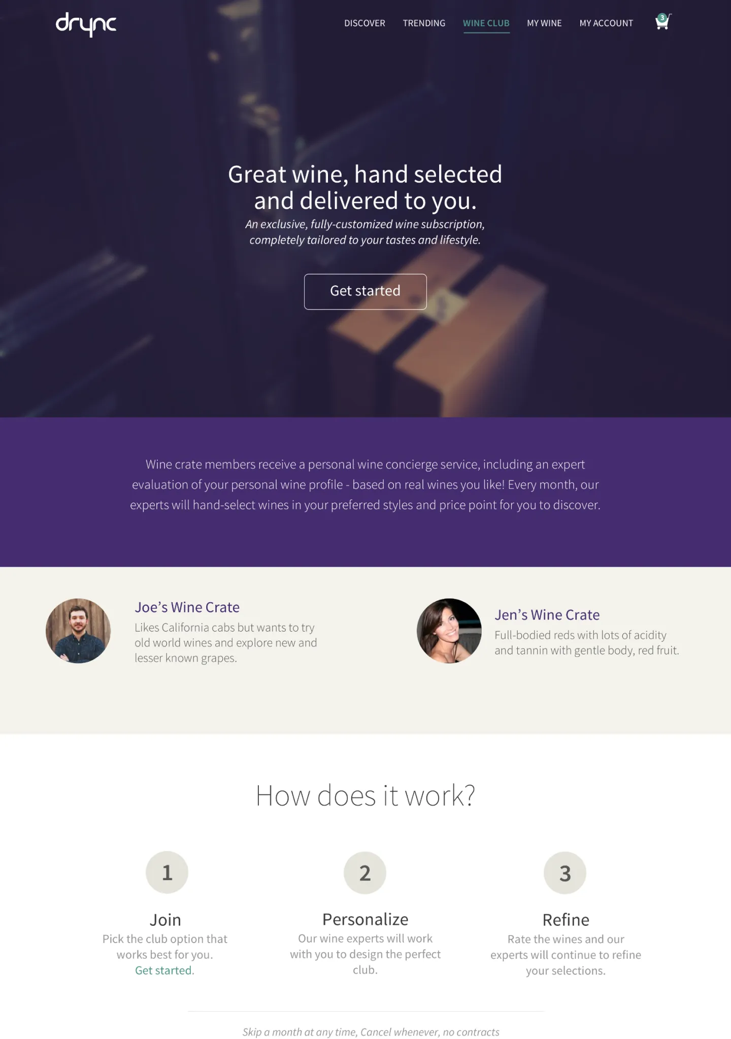
A test launch of a wine subscription service. The idea was to offer users wine selected by professional sommeliers, based on the ratings and reviews of the wines they scanned in the Drync app.
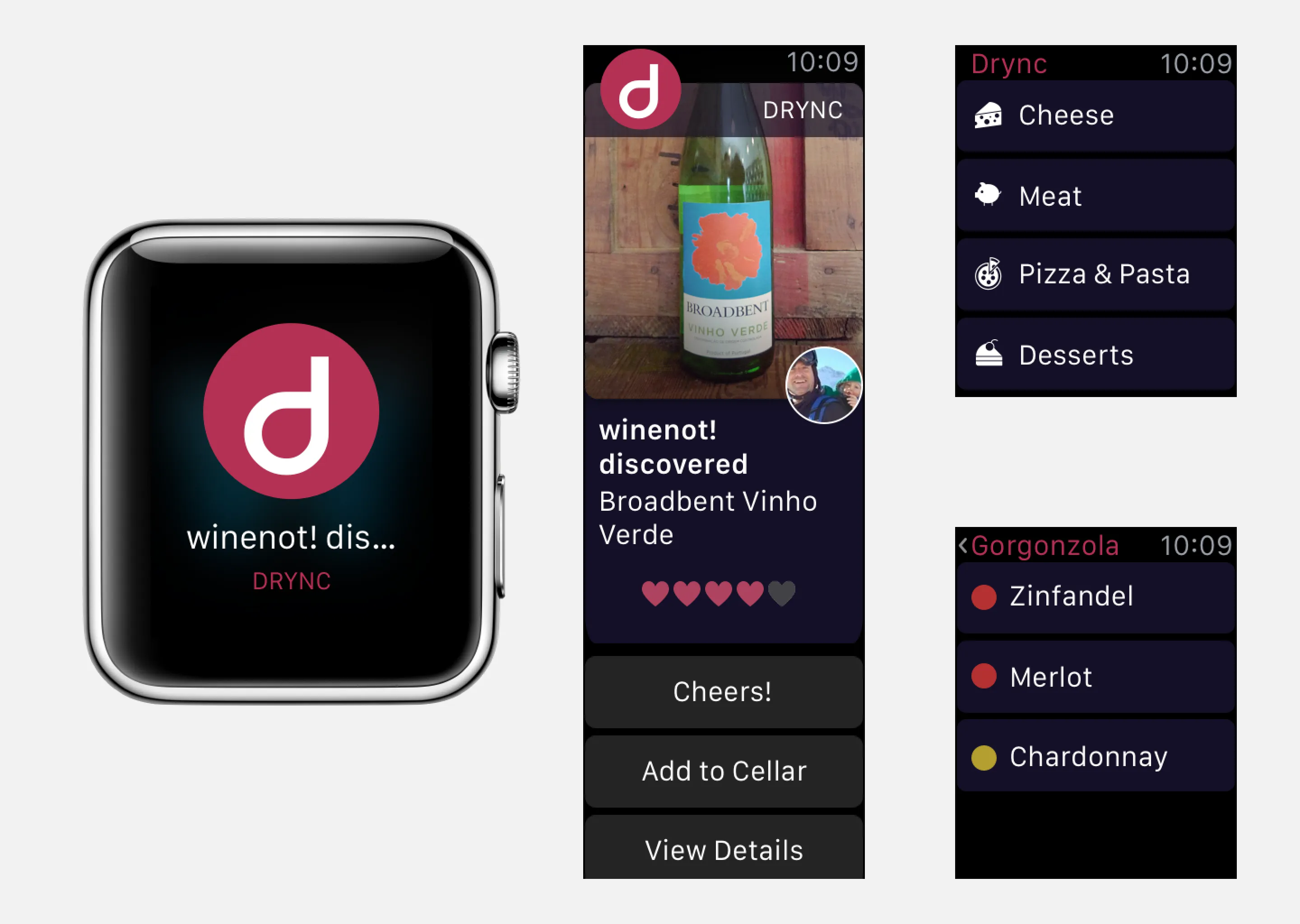
When the Apple Watch was announced we immediately looked to create a companion app for Drync. The Apple Watch was and is perfect for app notifications. However, we wanted the app to have some use beyond that. This iteration looked at offering users a way to have all of our wine pairing information at the tip of their fingers without having to take their phone out of their pockets.
A storefront for local wine stores
Later, we extended the product into a white label platform. Local wine stores could run their own branded storefront, with self-service inventory management and their own subscriber base. Dozens of stores signed on before the rollout was handed off to someone else.